Nuhom
A real estate platform that gives buyers an advantage, and agents fewer headaches
Role
Lead Designer
Timeline
4 Months
Team
1 Designer, 2 Founders

Background
Most real estate solutions are built for the agent, not the buyer (or seller). This frequently leaves buyers feeling dejected by a poor home buying experience. Nuhom is a platform created to empower the user in the daunting journey of buying and owning a home.
Challenges

Scale from an inbound landing page to full CRM

Understand the needs of 3 distinct user groups and how the real estate industry works for and against them

Guide founders through the product development cycle
I was clueless about the industry, but I understood ecommerce very well, and like ecomm, this was a transactional experience, albeit a more emotional one.
Looking at the experience through the lens of other high-end ecomm, I could break it down into stages:
-
Researching (learning about home owning, getting a feel for prices, etc.)
-
Browsing and favoriting a limited-stock product catalog (searching for homes)
-
Considering additional features (contingencies, insurances, etc.)
-
Moving through a checkout funnel (submitting an offer on a home)
Understanding users
Who I had access to:
-
The founders - both were experienced buyer and seller agents
-
Regional users - recent clients, friends, and neighbors, who'd gone through home buying
After a series of user interviews, I was able to lead us in a persona creation workshop, and come up with a few examples spanning a dozen important traits in real estate personas.
I can't display the finished personas, but I can show how the workshop started:

Once we had personas, we mapped out the site and its nuanced experiences.
Search, education, home touring, pre-approval and lender applying, selling, creating offers, account dashboard, calculators, and many, many others.
Getting an idea of how users would move around the more focused experiences helped us visualize what our users needed and where they could get stuck, even at the "happy path" level like this:

Let's make a long story short
We built a site map, user journeys, and, with the insights from user interviews, loose wireframes and prototypes. I'd love to share those but they're currently under NDA lock & key. After a couple months, we'd gotten far enough to have fleshed out experiences that resonated with what our users would need.
Then everything came to a halt.
We came to understand that we weren't going to start with the traction we needed to be successful. What we were building was the ultimate goal for empowering buyers, but we didn't have as much of one key element as we thought we'd have to make that possible: seller buy-in.
After understanding that we wouldn't have the seller base we expected, we decided to pivot. Fortunately we hadn't committed to developing anything yet, and the prototypes we'd built so far aided in our epiphany.
The pivot
The experience we'd built is something we'll be able to come back to, and knowing where we wanted to go once we cultivated a larger seller base was extremely helpful.
The new goal was to court seller agents with a platform that would encourage them to list with us first. As the Nuhom founders were both agents themselves, I again had access to users via their network, and was able to sort out and prioritize pain points with them. The largest was a lack of organizational tools agents needed to keep track of listings and the nuances of buyer details.
With an idea of how to serve sellers, we began to curate the features that would make a difference in their lives. Modernizing antiquated interfaces and making reporting more useful was valuable, but I knew it wouldn't be enough to pull users away from the tools they had a habit with. That's why "making life easier" wasn't good enough for V1, and we decided to include more features in V1 to increase the likelihood of early adoption.
Additional CRM features would allow the seller agents to:
-
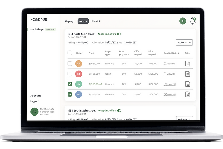
Easily accept, reject, and document buyer offers in the same place
-
Better facilitate communication with buyer agents at every step of the process (a boon to buyer agents that would also endear them to us before we approach them as the next target audience)
We broke the tools and details down to simple containers to visualize how it could turn out, and grew it from there.


We filled in the blanks, iterating on different ideas and came out with a V1 concept we were happy with. Some of the vision shows in these WIP mocks.


Look and feel
When the founders asked me to explore the brand, I tried to understand how I wanted this product to feel. We were trying to change the way buyers and sellers handled their homes. For most people, this is a very emotional transaction, and one that they may only make a couple times in their lives. I needed it to feel like the positive concepts of walking into a new home that most people imagine. I needed it to feel warm, inviting, safe, and tranquil; adjectives that aren't typically used to describe the home buying/selling experience itself.
Concept 1
My first concept was "morning light splashing on walls through warm curtains."
I found some images that captured that and extracted the colors from them.
This pallet didn't end up working for me. Some of the color combinations were bright and fun, or on the earthen adobe side of warm, which was attractive, but not quite the feeling I was trying to impart.

Concept 2
I wasn't done with the feeling of light and warm spaces, so the next concept was "afternoon light splashing on walls in neutral, lived-in environments."
I went through the same process and was much more pleased with what I'd extracted. I knew immediately that these were too saturated, but I could see how, if we were to soften them up and cherry pick the right ones for the right feelings, we could be on to something here.

I applied some of Concept 2's colors to the background of these "filter" wireframes to act as the home's wall, and others to the elements to act as the home's accents. These designs aren't final, but our testers agreed they each convey a warm, lived-in feeling in their own way.


Judging by user feedback and our own thoughts on how the site should feel, we ended up going with the green, albeit somewhat different from what you see above.
Our users noted how the slightly warm background and green accents reminded them of some of their favorite places in their homes, and for some, it made them think of the potential favorite places in their future homes.
In either case, it was a warm, well-lit room with plants.