THE GROMMET
Founded in 2008, The Grommet is a product launch platform for innovative, new to market products. It is the first curated, online commerce platform for both B2C and B2B discovery and sales of niche products by Maker entrepreneurs.
The Challenge
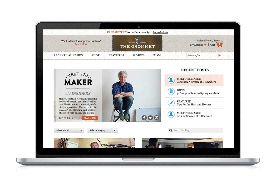
The Grommet's client-facing blog
I was given an assignment by The Grommet to re-design their client-facing blog. My only directions were to keep the header and footer intact, as well as to keep in mind the current branding and identity.
The Research
My initial hypotheses were obvious to me, but it would take user testing and research to validate them. I started with competitor research, as well as general research into what functional modern blogs should be. After using and absorbing dozens of blogs (brit.co, helpscout.net/blog, design-milk.com, fubiz.net, webdesignerdepot.com, blog.crew.co, blog.brika.com, shopify.com/blog, notcot.org, to name a few) I made lists of what I thought worked well and what didn't. With that information collected, and after using The Grommet's blog extensively myself and recording my own expereince, I sat down with several more users to observe how they behaved on the site and what they thought of it, following up each session with a quick survey. With most of my hypothesis proven, I began applying the information I'd gathered to the new design.
New and Improved
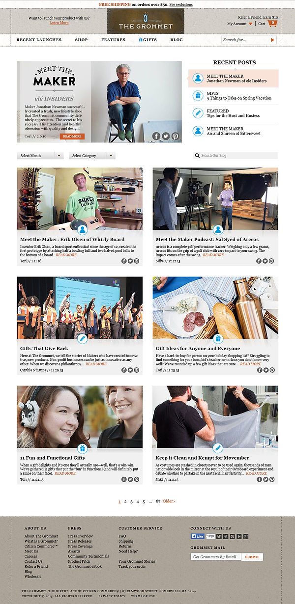
Exploring the re-design
The four most recent posts are encompassed in a larger "featured" slideshow as the first thing the user is presented with. The post displayed in the slideshow will correspond with the highlighted story to the right of it in the “Recent Posts” list. As the slide changes, the highlight will progress down until it cycles back to the top and repeats. When a new story is posted, the last story in the “Recent Posts” list will move down to the columns below.
Categories will be represented by easily recognizable symbols that the user can identify without reading a headline. As content is not posted frequently yet, a 2 column system with large imagery would work well to organize the information without looking too sparse or being overwhelming.
The hierarchy is arranged to be easily responsive, where the “Recent Posts” section could move under its accompanying slideshow and the posts below it could adapt to different column and row numbers depending on the dimensions.
The “Select Month” and “Select Category” dropdowns will be placed where the archived stories begin, which will customize what the user sees below the Recent Posts. The default will be normal chronological archival order.
The blog’s search bar will be on the same row as Category and Select Month, as having it at the very top, too close to the site’s dedicated search bar, could confuse users. This follows the trend of doing away with sidebars when possible.
Each story will display a Header, subheader, category icon, “read more” CTA, author, date published, and easy-to-find social share buttons so the article can be quickly shared without the user needing to dig for it. The social share buttons would have individually brand colored hover states. The website branding, as well as the site's dedicated header and footer, are still intact in this design, as requested.
Side by Side Comparison
Out with the old, in with the clean and functional

Note: this design carries on like this for over 10,000 additional pixels.
